This article was originally published on Travlerz
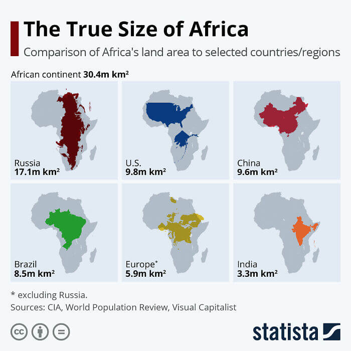
A Map That Shows The True Size Of Africa
It's not a secret that because of the fact that most maps are flat and the world s round, the true size of some places has to be distorted a bit. But this map tries to give people an understanding of just how large the continent of Africa is when compared with some of the larger countries out there. As you can see, the U.S. could probably fit in the continent two or three times over.
Meanwhile, the content spans the entire length of Russia while also being twice as wide in some places. On a normal map, these two areas would be pictured about the same size.
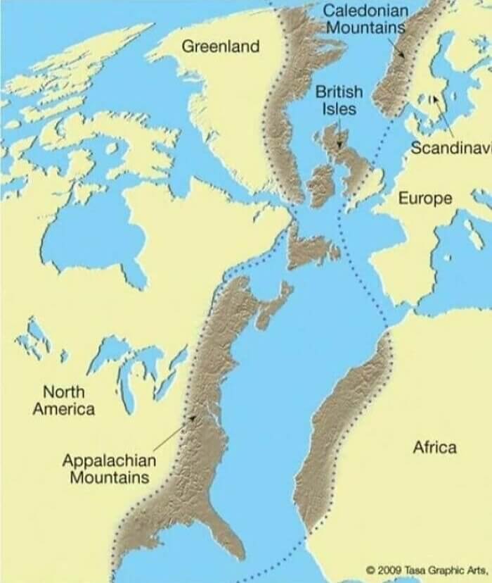
Just One Long Mountain Range
When we think of mountain ranges, we don't usually think of them for what they really are, geological formations that can span the entire planet. However, that's exactly what this map depicts. It shows how the Appalachian mountains in the U.S. actually connect with the Scottish Highlands and the Atlas Mountains. When all of these continents were once joined together, these ranges formed the Central Pangean Mountains millions of years ago.
However, today they're separated by an entire ocean in some places. If you were to look at a normal map you could probably still make out the lines shown here if you use a bit of imagination.
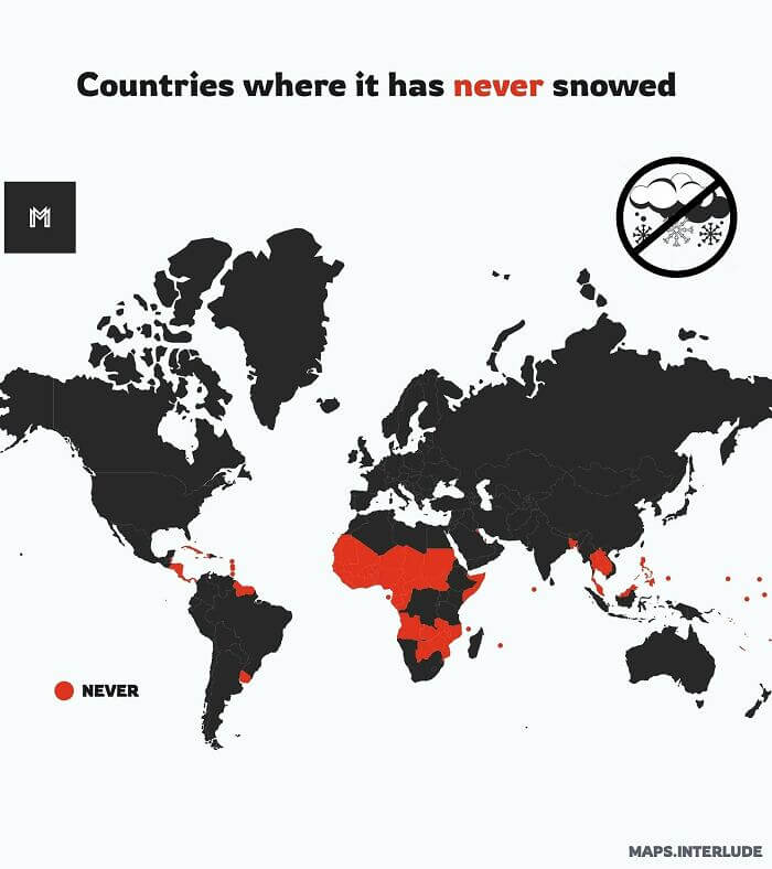
Countries That Have Never Received Snow
It might seem implausible, but believe it or not, there are some countries out there that have never received a single drop of snow. Those countries are shown in red on this map. As one might expect, most of them are located near or around the equator since it has to be decently cold in order for it to snow. Still, some of the countries on this list are a bit surprising.
For example, we would've thought that a lot of the countries in Africa that are shown in red would have at least a couple of mountains that might receive some snow.
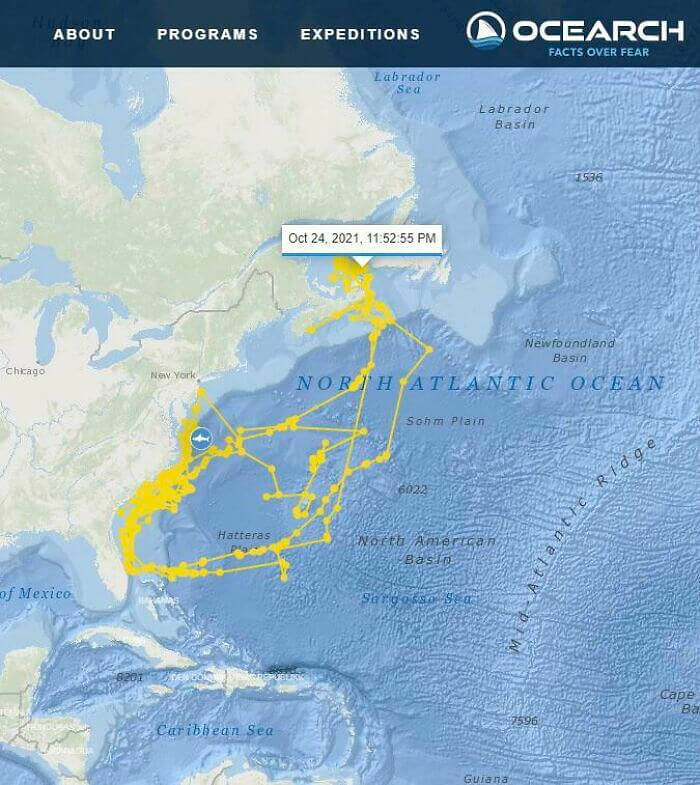
A Shark Drew A Self Portrait On A Map
The focus of this map isn't actually a geological feature. Instead, it shows where a shark that was tagged traveled off the coasts of the U.S. and Canada. The animal's path ended up looking eerily similar to the outline of a shark. We're sure the shark wasn't doing it to troll the scientists tracking it, but it's still a funny coincidence nonetheless. It also shows just how far these animals can travel in a short amount of time.
Not to mention how much time they actually spend closer to land and beaches, probably feeding and hunting. We can only guess what they spend their time doing out in deeper water.
A 1513 Map Of Europe
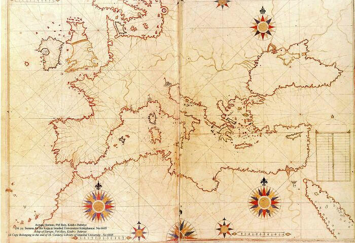
This map was made by a Turkish sailor and cartographer named Piri Reis in 1513. Not only is it extremely beautiful, but it's way ahead of its time and shows Europe with a level of detail that just wasn't around up until that point. The coasts of the Mediterranean, in particular, are pretty accurate. Some of the other parts, however, seem as if he maybe used other sources or second-hand accounts.
For example, Ireland has a giant bay or lagoon in the middle of the island, which we know today is not actually there. The coasts of Scandinavia look a little off as well.
Mexico's Borders Before The Mexican-American War
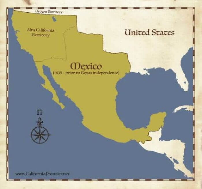
When the U.S. was a newly formed country, it and Mexico went to war. The war ended with Mexico ceding a large amount of territory to the fledgling state, and today, the war isn't really talked about a whole lot. For that reason, most people don't know just how much territory the U.S. gained from the war, which was a lot. Pretty much the entire southwest portion of the country was once a part of Mexico.
This map basically shows what Mexico would look like today if it had retained all of its lost territories, or if a new Mexican president asked for that territory back.
Exorcisms In Europe
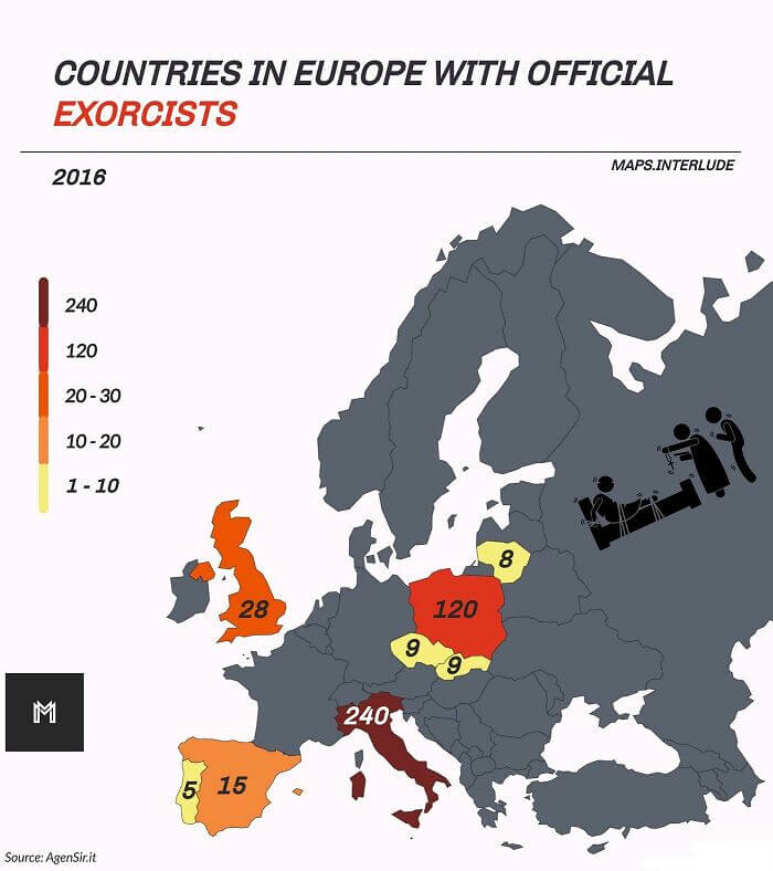
Exorcisms might seem like something that only happens in movies nowadays, but they still very much occur. This map shows the number of exorcisms that were conducted in Europe in 2016. It's actually really surprising how many official exorcisms were conducted. Some of these countries also make a little bit of sense, such as Italy considering that's where the Catholic church is based, but others took us by surprise.
Spain and the U.K. both have a pretty high number of exorcisms. We'd also be really interested to see a map of like this of the western hemisphere.
Asia At Night
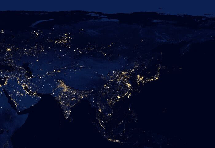
We're not sure if you can technically call this one a map, but it's really cool nonetheless. It's a photo of Asia at night. You can tell where the more densely populated areas are from all of the lights. However, there are other areas that look like they're just devoid of electricity or population. For example, South Korea looks extremely lit up compared to its neighbor to the north. Eastern Russia is also pretty dark.
India and Western China, by contrast, are extremely easy to see, probably due to the immense size of their populations and all of the cities in those areas.
Current Cities That Are Older Than The U. S.
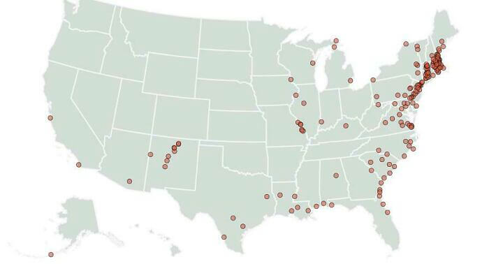
It's not a secret that the U.S. is a comparatively young country compared with most of the rest of the world. But that still doesn't change the fact that it's a bit weird to think about some U.S. cities being older than the country itself. This map shows where those cities are located. Some aren't so surprising, such as the cities in the northeastern portion of the map or those along the Gulf of Mexico.
However, some of the cities in the midwest took us by surprise a bit, as well as those along the Great Lakes.
A "Where Are You From" Map In Iceland
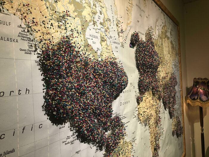
This is a map at the Aurora Museum in Reykjavík, Iceland. Anyone who visits the museum can place their own pin marking where in the world they are from so that others who visit the museum can see where all prior visitors traveled from. As you can see, there are quite a lot of people from the U.S., Europe, and Asia, who have visited the museum in the past.
There are so many, in fact, that the pins from those places are piling up pretty high, and there are even contours in the map. In contrast, places like Africa and South America are represented far less.
Mapping Out A Fox's Journey From Norway To Canada
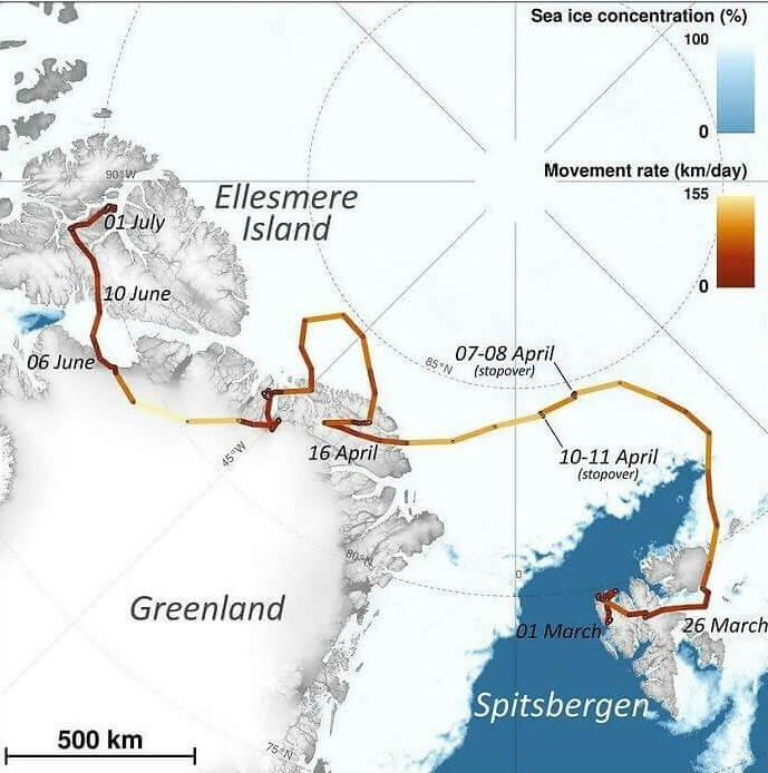
This map shows the incredible journey one Arctic fox made in 2018. The little guy walked from Norway in Europe all the way through the Arctic and into Canada. It even shows how far he'd walk in a day and the level of sea ice at the time of his journey. We're not sure why he walked this far, but it's incredible to think that animals can and do go to such extreme lengths in search of things like food and shelter.
Most of us can't be bothered to walk to the store on most days, yet this little guy walked across continents like it was basically nothing in only a few months.
U. S. States Where Landlords Can Evict Tenants For Being Gay
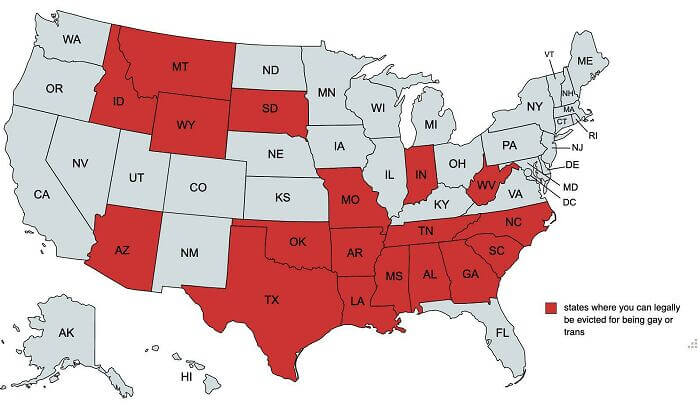
Even though being homosexual is completely legal in the U.S., and states aren't supposed to discriminate based on sexual orientation, there are a lot of states out there with laws that make it legal to evict someone if they are gay. This map shows the states that allow landlords to evict those who are gay or transgender, and it's almost half the country, particularly in the south and northwest portions of the U.S.
We're not completely sure how this jives with federal laws, but it probably has something to do with who who's not listed under "protected class" in these states. Meaning that these states allow landlords to evict anyone without cause, but if tenants can prove that an eviction was done based on sexual orientation, then they have a case.
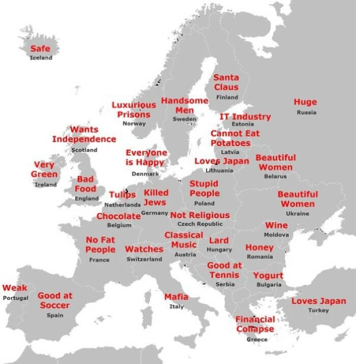
Japanese Stereotypes Of Europeans
Sometimes maps can be fun in the way that they show how others view particular people or places. This map shows the stereotypes Japanese people have about European countries and people, and some of them are pretty hilarious. For example, the Japanese associate everyone in Denmark with being happy and think that there are no fat people in France. Likewise, they think of the mafia when they think of Italy, and to be fair, people from a lot of other places probably think the same.
We're not exactly sure what's going on with Portugal, but Turkey seems to be doing a good job when it comes to wooing the Japanese and that one has us a little confused as well.
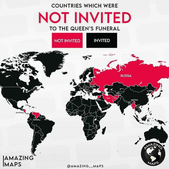
Countries That Weren't Invited To Queen Elizabeth's Funeral
This map shouldn't come as that much of a shock, but it's still pretty interesting to see something like this visualized on a map. This shows all of the countries whose representatives weren't invited to Queen Elizabeth's funeral after she passed away. It wouldn't be too hard to guess who might and might not receive an invite. The usual suspects are all there, such as North Korea and Syria.
However, besides a couple of other countries, pretty much everyone else in the world was invited to attend, even a couple that we could've seen not receiving an invite.
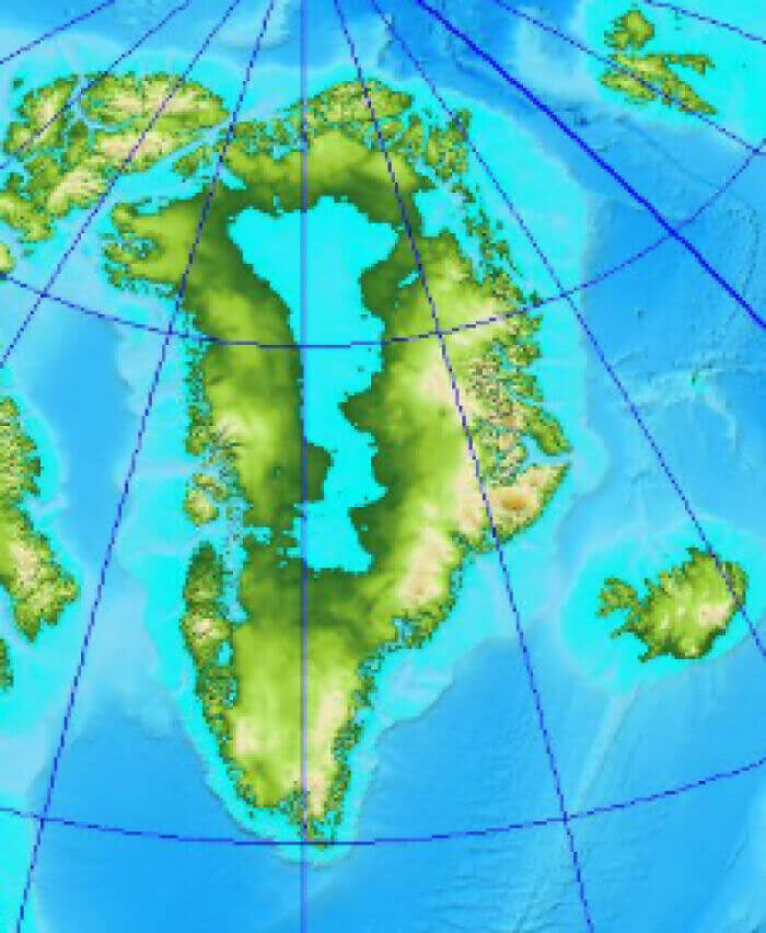
Greenland Without Ice
This map is actually really interesting, even though it basically shows something that most of us never think about: what would Greenland look like without ice? It turns out it'd look pretty cool. The landmass would have a giant lake or sea in the center of it if it weren't for all of that ice. We certainly hope that the ice never disappears because that wouldn't be good for anybody, but if it did that'd be an interesting thing to see.
However, if all of the ice were to melt, who knows what it might look like with such an extreme rise in sea levels. It'd likely be a lot smaller than it is now.
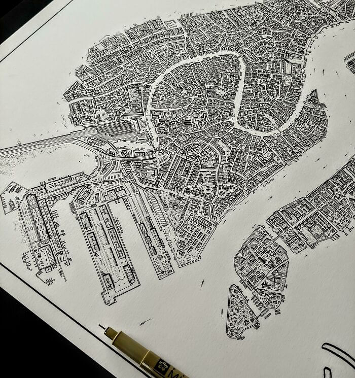
A Hand Drawn Map Of Venice
Drawing anything by hand is pretty hard, much less an intricate map of a city with narrow streets and canals. But that's what someone did with this hand-drawn map of Venice, Italy, and the result is pretty amazing. The map itself is incredibly detailed, and you could probably even use this thing to get around if you were willing to risk it getting wet and ruining in one of the canals.
A better idea might be just to frame this map and put it up on a wall somewhere. It'd certainly make for a pretty interesting conversation piece, especially if you were the one to draw it.
European Countries Rated As More Progressive Than U. S.
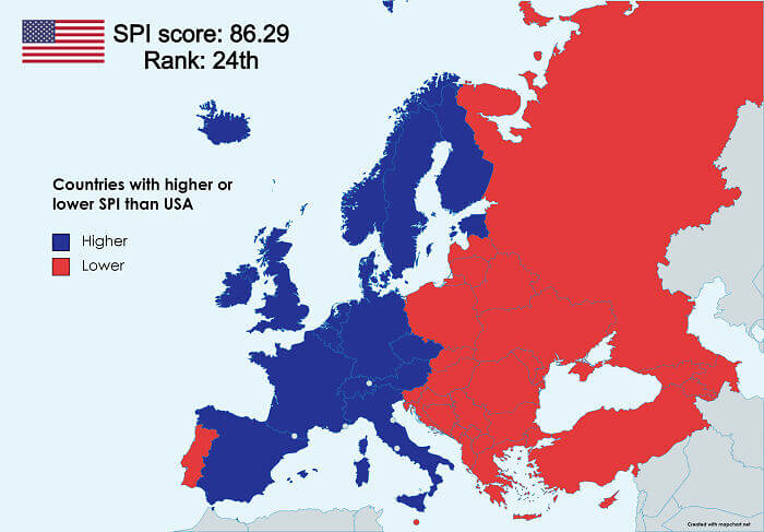
This map probably shouldn't be too surprising for most people, but it basically shows which countries in Europe are rated as more progressive than the U.S. by the Social Progress Index. As you can see, pretty much all of Western Europe is rated as more progressive, while Eastern Europe and Russia are rated as less progressive. The only outlier is Portugal. However, it's also kind of surprising that Greece is also less progressive.
It also shows where the U.S. ranks out of all of the countries, which is around 24th. If you're curious, the index has a full list of all the criteria it uses to come up with its rankings.
The Line To See Queen Elizabeth II Lying In State
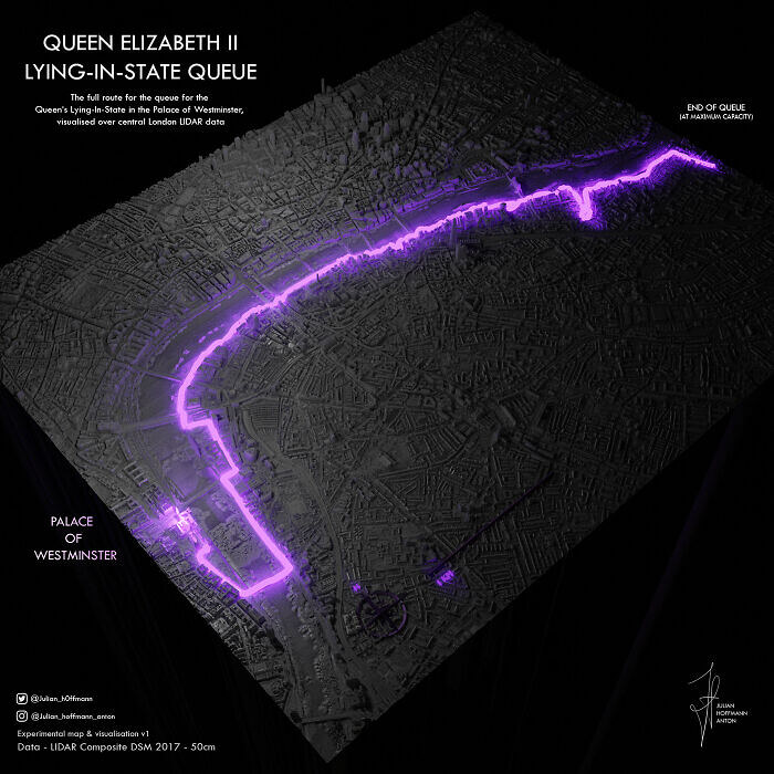
This map shows what the line was like to see Queen Elizabeth II lying in state after her death. It's not surprising that thousands of people showed up for the event, but it is surprising just how long the line ended up getting. It pretty much stretches from Westminster Abbey all the way across the city and along the Thames, which is pretty impressive. We just wonder how all of those people passed the time.
It does also add to the stereotype about the British and their love for lines, or as they would say, for "queues." Truly, nobody can queue quite like the British.
A Map Of Those Who Believe In God
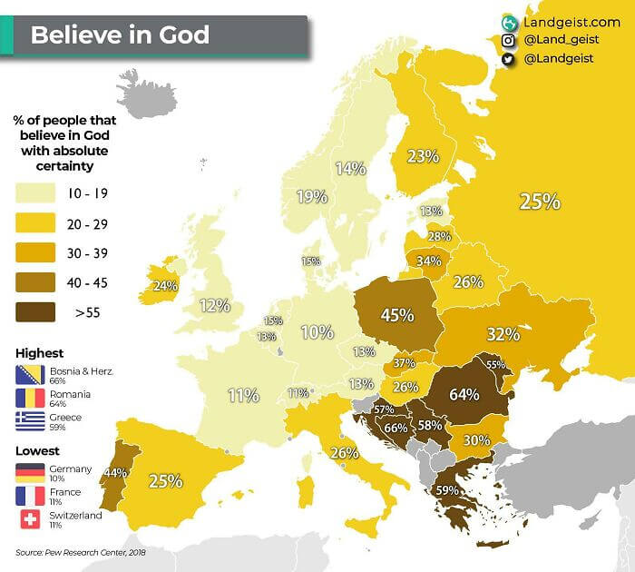
This map doesn't exactly show everyone who does or doesn't believe in a God, but it does show the percentage of countries' populations who believe in a higher power. That percentage is pretty low for most Western European countries, with Ireland being one of the only outliers. However, many Eastern European countries have a higher percentage of people who say that they do, in fact, believe in God or are religious.
Maybe one of the more surprising findings on this map is that Italy has a somewhat low percentage of people who say they believe in a God, considering that's where Catholocism is based.
A Carved Map Of Mexico
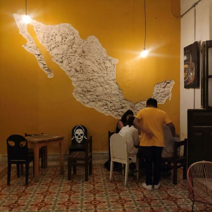
While most maps are digital, drawn on paper, or come in the form of a globe, that's not the case here. This stunning map of Mexico was carved into a wall, and it can be found in a bar on the Yucatan peninsula. We're not sure how long it took to carve or who made it, but it'd certainly be an interesting sight to see, especially while sipping on a beer.
It also looks like the map is carved into stone, which makes us wonder exactly where this is or what the rest of the bar looks like aside from this single wall.
Countries In 250 Million Years
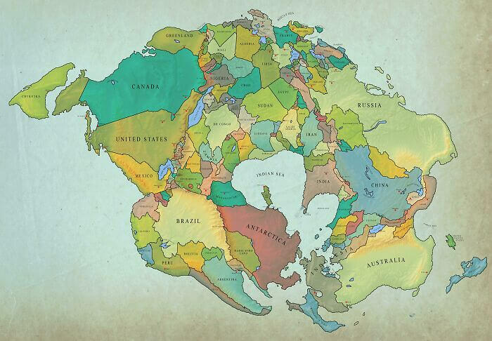
Most people are aware that the Earth looked very different millions of years ago. Continents were hundreds of miles from where they are now, and in some cases, they even bordered each other. This map shows what countries and continents would look like in 250 million years if all of the countries of the world were to keep the same borders as they have now. And it looks a bit crowded.
Of course, it would be cool to have one supercontinent with a giant inlet or bay in the middle, but we could imagine all of the conflicts that might arise if everyone was so close together.
All Of The Countries Where Police Don't Carry Guns
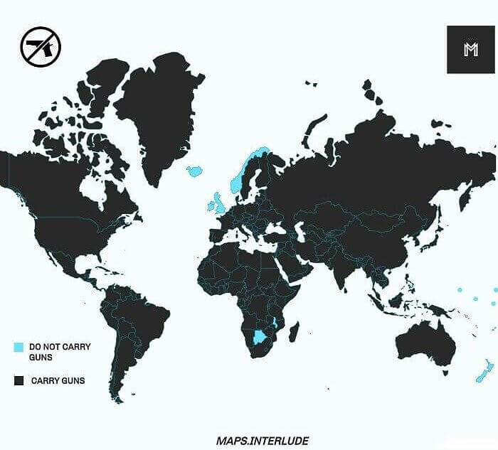
This interesting map shows all of the countries of the world where police don't typically carry firearms. The list is pretty small, with only a handful of countries in which most police don't carry guns. Of course, there are exceptions, and it wouldn't be uncommon to see specially trained police carrying firearms in the U.K. But this is generally only the case at large tourist attractions or where they have to be prepared for anything.
It's actually surprising how few countries there actually are that have police who don't carry any type of firearm. We would've thought there might be a couple of more countries on this list.
A Globe For The Blind
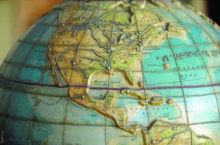
We don't often think of it, but there are actually plenty of globes out there designed to be used by those with seeing impairments. These globes and maps are made in a similar fashion to Braile in that they use physical markers so that those who are blind can study where continents, countries, and oceans are. This particular globe even has some of the major rivers running through North America.
It's also really stunning to look at as far as globes go. The colors and elevations of the continents really make for an interesting look at the world.
Comparing The CO2 Emissions Of China And The Western Hemisphere
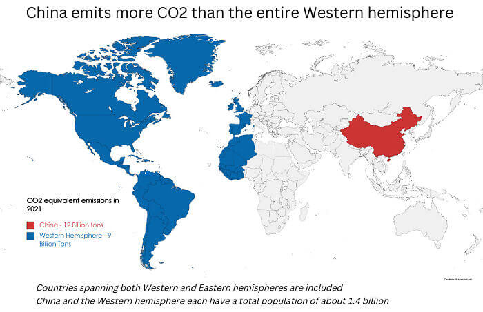
This map compares the CO2 emissions of China with those of the entire western hemisphere. Pretty much, it's saying that China emits as much CO2 as every country in blue combined, which is a lot. However, there are some things to keep in mind. Firstly, China has a population equal to that of the western hemisphere. It's also had a heavy focus on manufacturing in recent decades, which heavily contributes to CO2 emissions.
Much of that manufacturing was intentionally shipped off to China, while a lot of it was sponsored by the Chinese government. But either way, it's a pretty crazy stat.
A Map Of Google Street View
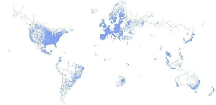
This map shows the world as seen through Google Street View. All of the areas in blue are basically instances of Street View. In places like the U.S. and much of Europe, the entire map s pretty much filled in. Of course, that's with the exception of Germany, which has strict privacy laws. But in other places where roads might be scarce or laws that are completely different there aren't that many Street Views.
For instance, much of Canada is entirely blank due to the country having a large amount of wilderness. The same can be said for central South America, where the Amazon rainforest is located.
The Legality Of Homosexuality Worldwide
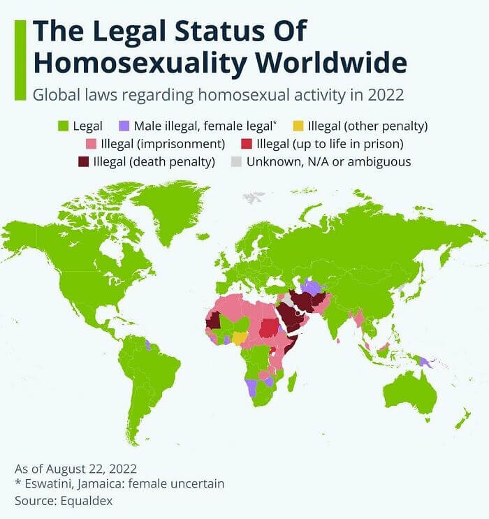
This is another interesting map, and it shows if, where, and to what degree homosexuality is legal throughout the world. As you can see, it's completely legal in North America and most of South America, as well as much of the rest of the world. The only outliers are parts of Africa, along with the majority of the Middle East and some parts of Asia. Of course, even in areas that are green, there is going to be some discrimination regardless of the laws.
The interesting thing about this map is that it shows the varying degrees to which homosexuality is tolerated in countries where it's still considered controversial or maybe not fully legal.
Countries That Still Have At Least 50% Forest Coverage
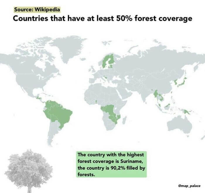
This one is a bit depressing. It shows countries that still have at least 50% forest coverage. At one point in time, a map like this would've included most of the world, except for more arid environments, obviously, but today there are only a handful of countries with significant forest coverage. Among those countries are places like Brazil, where illegal logging threatens much, if not most, of the Amazon.
Still, this map should be taken with a grain of salt as this doesn't factor in wild places that don't naturally contain trees, such as places like plains or prairies.
Someone's Road Trip Around Africa
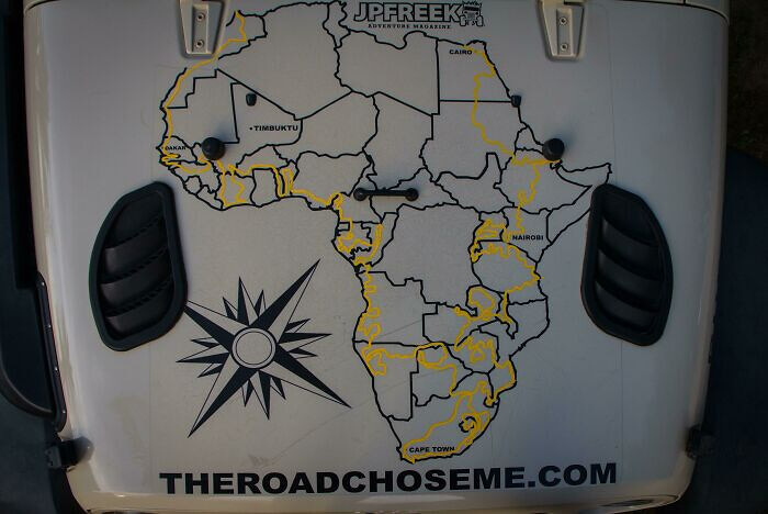
This is a map someone made by someone who took a road trip around Africa. And if you know anything about how big Africa actually is, then you know that this is quite an impressive feat. It took whoever drew this around 999 days to complete their trip. That's insane, considering most of us are lucky to get two weeks off for vacation. They also drove around 53,500 miles and passed through 35 countries.
That said, we're wondering why they didn't do a detour to Timbuktu, considering it's one of the few cities shown on the map, and it would've been pretty cool just to say you've been there.
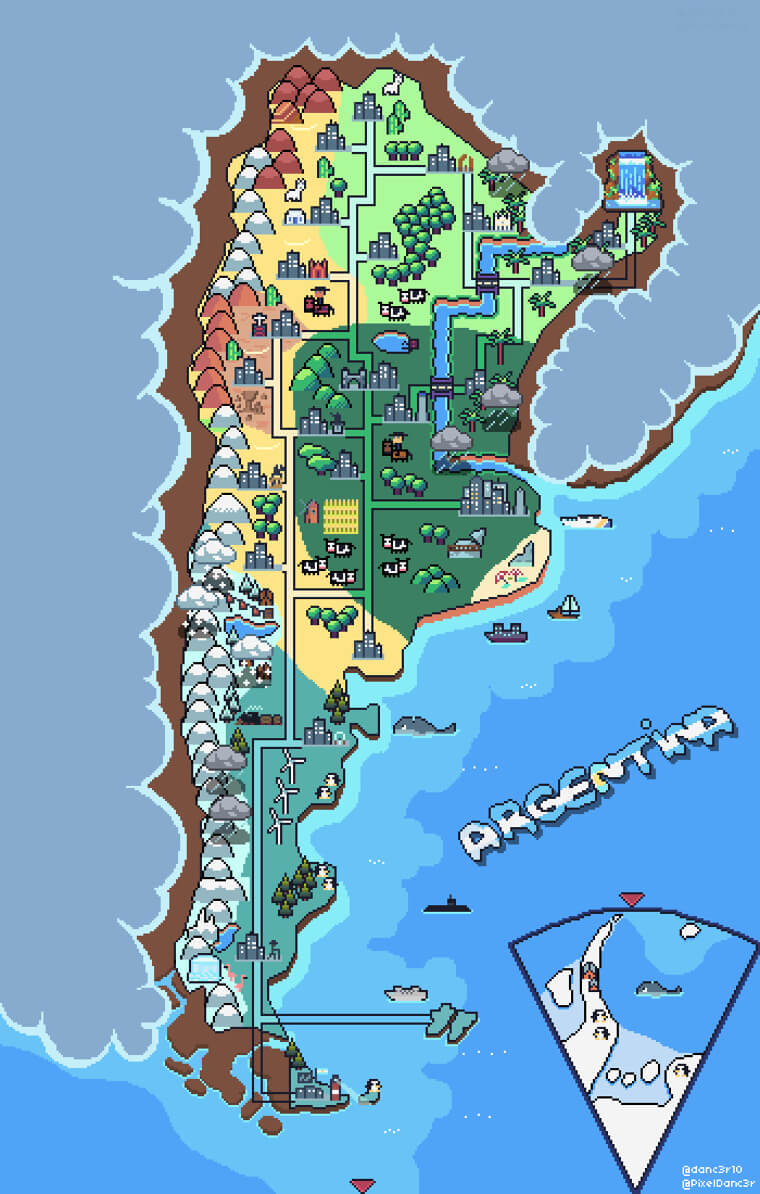
A Pixel Map Of Argentina
Maps have come a long way since they were primarily drawn on paper. Today, most maps are digital, and it's fairly easy for just about anyone to make their own maps. This unique pixel map was made by someone, and it shows Argentina with its various regions and physical features. The map also shows the different environments located within the country, such as the plains, forests, deserts, and mountains.
It also shows a couple of controversial areas that Argentina does now or did in the past claim as their own, but we won't get into that here.
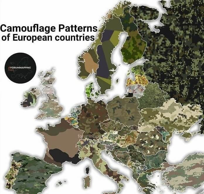
A Map Of The Camouflages Used By Countries
This is a unique map showing the different camouflage patterns used by the countries of Europe. As you can see, they vary greatly. For example, the primary camouflage pattern used by the U.K. looks nothing like the pattern used by Russia. This might have something to do with where each military expects their troops to be fighting if a conflict was to break out, but we can't be entirely sure.
That said, we would've expected most of the Scandinavian countries to be using a white camouflage pattern, considering how much snow they get but maybe they expect any potential conflict to happen during summer.
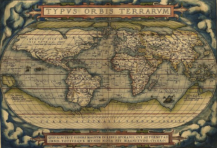
The First Modern Atlas
This beautiful map is called the Theatrum Orbis Terrarum, which translates to the Theater of The World. It is considered to be the first modern atlas of the world, and it was made in 1570. Aside from being really stunning to look at, it also says a lot about what people thought the world looked like back then. The continents of North and South America still have their general shapes for the most part.
However, they really distorted, while Antarctica looks massive compared with the rest of the world. Australia is also a bit off from where we usually associate it with being.
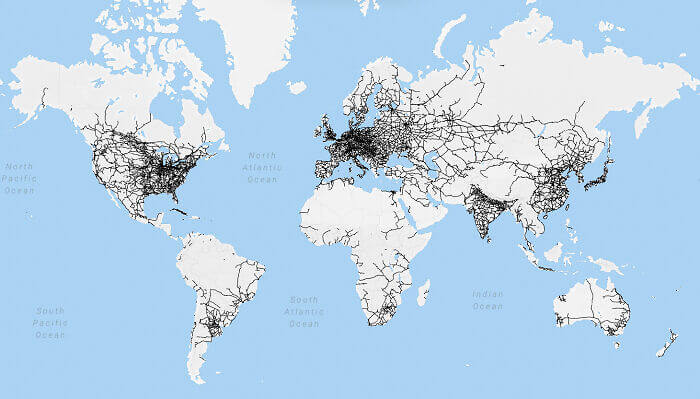
A Map Of The World's Rail Networks
This map shows all of the world's current rail networks, most of which are situated in the U.S., Europe, and East Asia. It shows how some countries prioritize their railways, but it's also a bit misleading. For example, even though the U.S. has a huge network of rails considering how large the country is, most of those are freight rails and travel isn't really practical by rail for most people.
Still, it's really interesting to see, especially some of the more remote rails, such as those in the Russian tundra or that one railway way off in the middle of Alaska.
Bands And Their World Tours
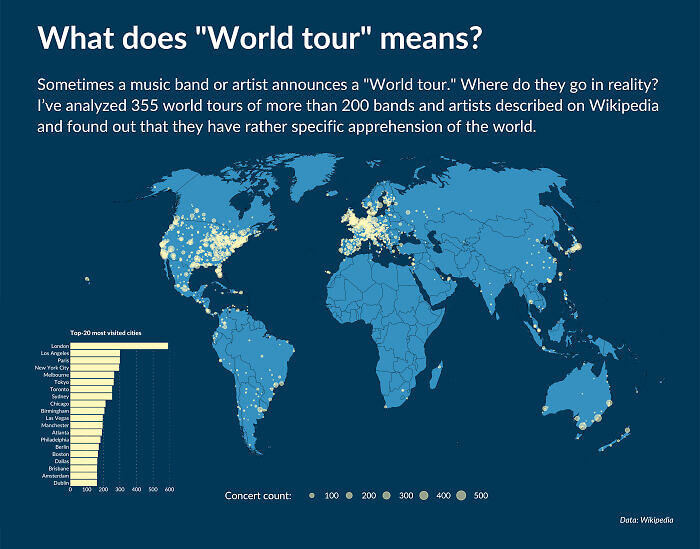
When you think of a band taking a "world tour", odds are you think of that tour as actually traveling around the world. After all, it's right there in the name. However, someone put together this handy little map that shows where 355 world tours and 200 bands ended up going during their tours. As you can see, most of them didn't exactly tour the world, far from it in fact.
That said, it's understandable, considering that a band obviously isn't going to have a concert somewhere that might not have a decent turnout. But then why not just drop the term "world" from the tour?
A Visualization Of The Pakistan Floods
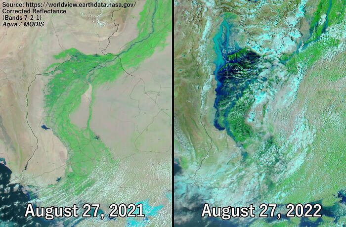
You've likely heard about the floods in the news lately, even if it hasn't exactly been covered in depth by most organizations. This map shows a comparison of Singh Province. The photo on the left is from 2021, while the photo on the right is from 2022. The scale of the flooding is absolutely massive, and most of the province is completely underwater in the photo on the right.
It almost looks as if there is a sea or giant lake in the middle of the province, and it really goes to show that this event deserves more news coverage than it's currently getting.
A Map Of The Casualties Suffered During WWI
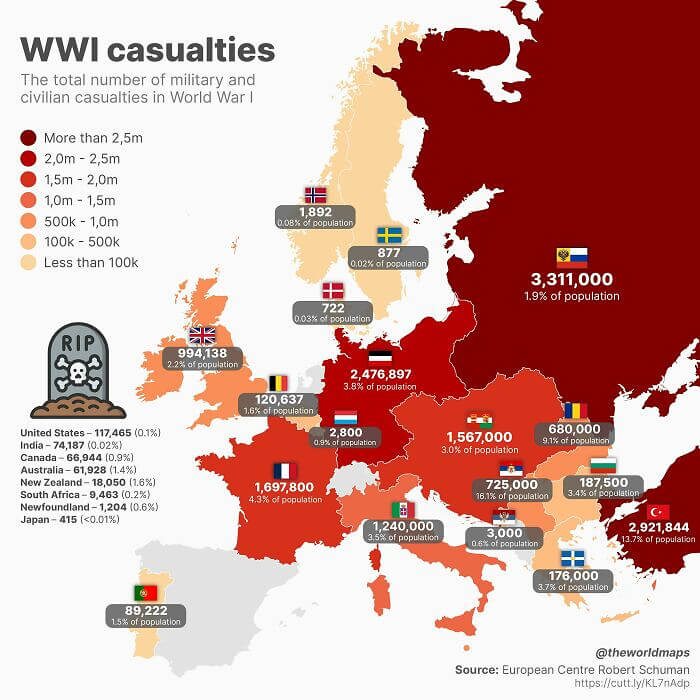
WWI is often overshadowed by the sheer brutality and amount of people killed during WWII. However, the first world war was in many ways just as horrific when it came to the loss of life, and this map shows how many people were killed in the conflict. It also breaks down those losses as percentages of countries' populations. Russia lost almost 2% of its entire population and suffered more casualties than most other countries.
Meanwhile, Turkey lost a staggering 13% of its entire population, and many other countries lost more than a million people each. It's also nice that this map lists some countries that aren't located in Europe.
The First European Map Of Japan
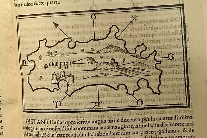
Everyone has to start somewhere, right? Well, this map is where Europeans started during their first attempt to map out the island of Japan. It's pretty hilarious to see, but we have to remember that they didn't exactly have Google Maps back then or a professional cartographer on board when they visited, apparently. The size of the castle in the southwest corner of the map is pretty funny, as well.
This does make you wonder, though, if the person who drew this map actually sailed around the entire island or if they just kind of guessed at the whole thing.
Mapping Europe's Drinking Preferences
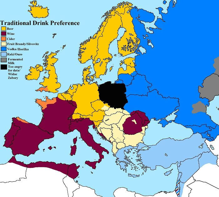
This interesting little map shows you what the preferred drink is in every European country. Most of these wouldn't be too hard to figure out on your own, such as the popularity of vodka in Russia or beer in Germany and the U.K. However, it's interesting to see what the most popular drink is in Greece, Turkey, and northwest France. It's also kind of surprising that it's not wine in the latter.
The only blip on the map is Poland, which was obviously too angry at the time to submit its numbers, to at least that's what the map says was the reason.
Getting From India To The U. S. In A Straight Line
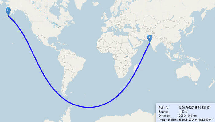
If you've ever needed proof of how some maps distort reality, then look no further than this map. It shows the route one would need to take in order to get to the U.S., traveling in nothing but a straight line. Yeah, that's what a straight line looks like on a map. Because the world is actually shaped like a sphere, the line shows up as a curve when in reality, you're just going around the globe.
Apart from that, it's also really interesting that something like this is even possible. We never really thought you could travel in a straight line from India and end up in the U.S.
Searches Broken Down By Bible, Quran, And Manga
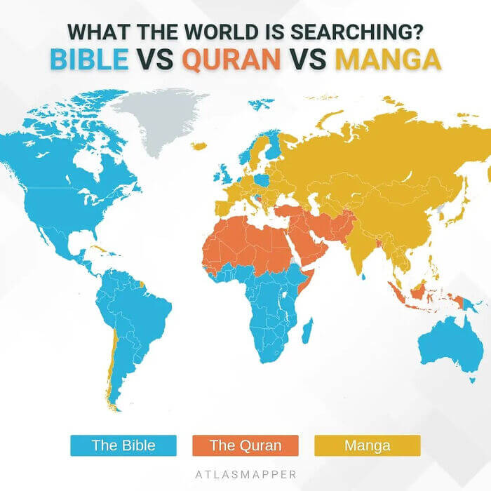
We'd never thought about comparing these three things before, but hats off to whoever did. It shows regions of the world and what was more popular in terms of online searches. Expectedly, the bible was searched for more in North and South America, while the Quran won out in the Middle East and North Africa. However, the number of people searching for manga was really surprising. Pretty much the entirety of Asia and Europe searched more for manga.
There are also portions of South America that searched heavily for manga, which makes us wonder why it's so popular in those particular countries and not in others throughout South America.
The Size Of Argentina
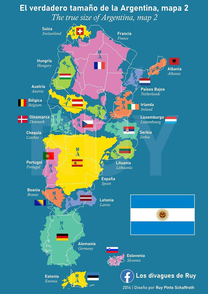
A lot of the maps on this list make attempts to show people the true size of some of the countries and continents out there that might look much smaller than they really are on traditional maps. This map does the same thing, but for the country of Argentina. Surprisingly, you can fit quite a few of the larger European countries within Argentina and still have plenty of room for others.
If you live in Argentina, then you probably already know this, but it was quite a surprise for us to learn that the country was so much bigger than we originally thought.

